1.先導入函示庫(build.gradle: Module)
dependencies {
   implementation 'com.google.android.material:material:1.3.0-alpha01'
}
2.程式碼範例
a.Layout布局
<?xml version="1.0" encoding="utf-8"?>
<androidx.constraintlayout.widget.ConstraintLayout xmlns:android="http://schemas.android.com/apk/res/android"
    xmlns:app="http://schemas.android.com/apk/res-auto"
    xmlns:tools="http://schemas.android.com/tools"
    android:id="@+id/blobLayout"
    android:layout_width="match_parent"
    android:layout_height="match_parent"
    tools:context=".MainActivity">

    <com.google.android.material.tabs.TabLayout
        android:background="#ffffaa"
        android:id="@+id/tabLayout"
        android:layout_width="match_parent"
        android:layout_height="wrap_content"
        app:layout_constraintEnd_toEndOf="parent"
        app:layout_constraintStart_toStartOf="parent"
        app:layout_constraintTop_toTopOf="parent" />

    <androidx.viewpager.widget.ViewPager
        android:id="@+id/viewPage"
        android:layout_width="0dp"
        android:layout_height="0dp"
        app:layout_constraintBottom_toBottomOf="parent"
        app:layout_constraintEnd_toEndOf="parent"
        app:layout_constraintStart_toStartOf="parent"
        app:layout_constraintTop_toBottomOf="@+id/tabLayout" />

</androidx.constraintlayout.widget.ConstraintLayout>
b.TabLayout設置
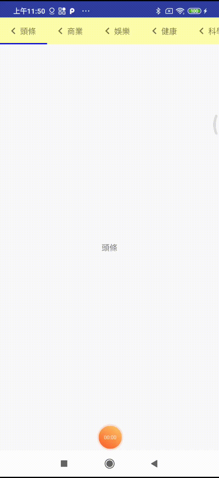
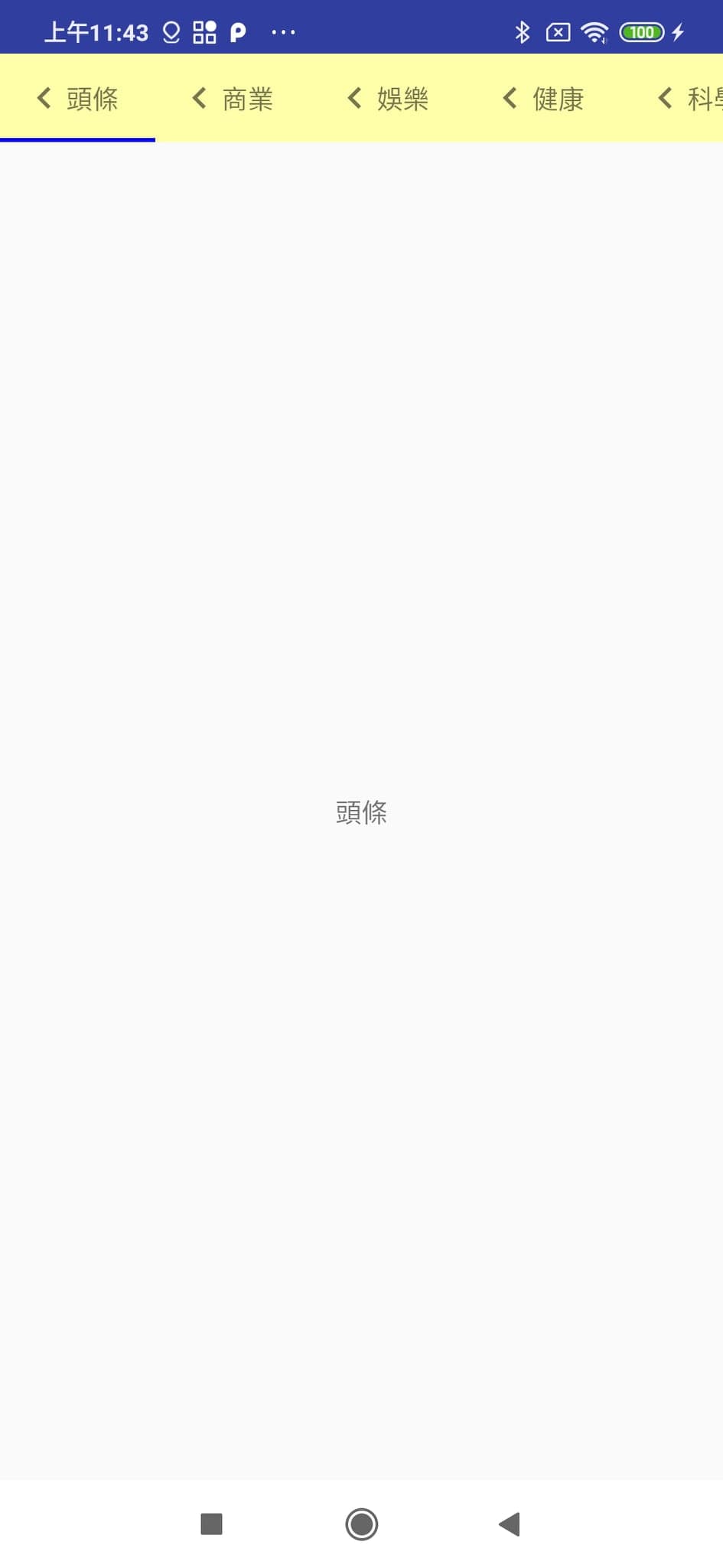
val mTitles = listOf("頭條","商業","娛樂","健康","科學", "體育")

//設置滾動
tabLayout.tabMode = TabLayout.MODE_SCROLLABLE
//設置選與未選顏色
tabLayout.setTabTextColors(Color.BLACK, Color.RED)
//設置下滑線顏色
tabLayout.setSelectedTabIndicatorColor(Color.BLUE)
//設置文字
mTitles.forEach {
    tabLayout.addTab(tabLayout.newTab().setText(it))
}
//設置取消下滑線
//tabLayout.setSelectedTabIndicator(null)
//設置下滑線寬度
// tabLayout.isTabIndicatorFullWidth = false
//設置下滑線高度
//tabLayout.setSelectedTabIndicatorHeight(30)

//客製化View
for (i in mTitles.indices) {
     val view = LayoutInflater.from(this).inflate(R.layout.icon_item, null)
     val title = view.findViewById<TextView>(R.id.title)
     title.text = mTitles[i]
     tabLayout.getTabAt(i)?.customView = view
}
c.Tabs & ViewPage & Fragment
FragmentPagerAdapter用來放入fragment
class FragmentAdapter(fm : FragmentManager, behavior: Int, private val mTitle: List<String>, private val fragments : List<Fragment>) : FragmentPagerAdapter(fm, behavior) {

    override fun getItem(position: Int) = fragments[position]

    override fun getCount() = fragments.size

    override fun getPageTitle(position: Int) = mTitle[position]

}
Tabs與ViewPager綁定
val fragments = mutableListOf<Fragment>()
fragments.add(Fragment1())
fragments.add(Fragment2())
fragments.add(Fragment3())
fragments.add(Fragment4())
fragments.add(Fragment5())
fragments.add(Fragment6())

//綁定
tabLayout.setupWithViewPager(viewPage, false)

viewPage.adapter = FragmentAdapter(supportFragmentManager, tabLayout.tabCount, mTitles,fragments)
viewPage.currentItem = 0
4.效果展示